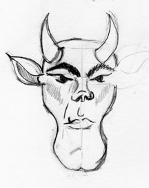
I used a similar process to the one I used for the shrunken head. Started with a sketch but this time only drew half the face. I drew a fairly detailed sketch so I knew were to put the lines and had an idea of the shading.

Once I had the sketch where I liked it I scanned it in and imported it to Adobe Illustrator. I scaled it to the size I wanted to work with, reduced the transparency to 50% and locked the layer.
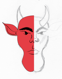
I then created a new layer and started to create my vector outlines. I start by roughing them in and then going back and refining them to follow the sketch. In some places I didn't like the way the lines look once added so I alter them to be more visually appealing. Once I had half the outline done I filled it in with a nice red to get an idea of how the shape looked.
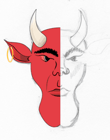
I created another new layer that I added the facial features to. I refined them also to make sure they looked like I wanted them to.


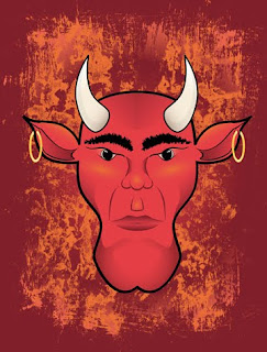
Combining the two halves gave me the whole face. I went in and tweaked it some more. Adding extra shading and details to make it look better. One thing I had noticed when I first combined the halves was he looked cross-eyed. I redid the eyes and liked the way he looked finally.
I added some colors and shading to the background and used one of the textures from Crumble. Crackle. Burn. to create the final look. I also used the image as one of my bottle labels for Monster Brew.


No comments:
Post a Comment