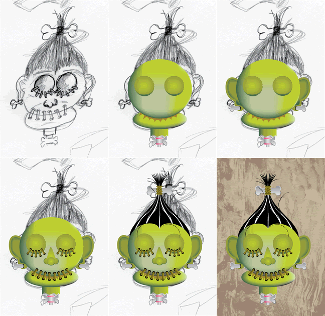
Since joining MonsterMonday.com I have been playing with different ideas and illustrations for it. This week I posted a shrunken head illustration I did and have decided to post about the process of creating it.
First I made a rough sketch of what I wanted and scanned it in for use as a template. It is a bit off balance and lopsided but it works for what I need.
I opened up Adobe Illustrator (AI), placed the image in as a background layer and reduced its transparency so it wouldn’t compete with the other lines I was going to draw. I started with a circle for the head and an oval for the mouth. I then shaded them to give them some dimension. Next I made one of the eyes and gave it a gradient fill and duplicated it to create the other eye.
I then moved on to the stitching. I made a vertical rectangle with rounded corners, gave it a gradient fill and copied it multiple times. After copying it, I placed it and rotated it a bit here and a bit there as I placed each stitch on the mouth and eyes. Once they were in place I made a black circle and placed them behind where the thread would have entered into and out of the head.
Next came the ears. I hid the head so I could see the sketch and drew a vector path around one of the ears. I went in and tweaked the points to give it the curve I wanted and changed the line to a path. I created the bone and made it look like it was going through the ear, grouped the lot and copied and pasted it. After pasting it I flipped one vertically and placed it in the approximate position of where the ear would be. I revealed the head and eyes and positioned the ears where I thought they looked best. I had a nice little bald shrunken head.
It needed hair so I again hid the head and created a vector path of half the hair, tweaked it, copied and flipped. I than added the leather tie at the top using the stitching I had created earlier along with duplicating and enlarging the bone that was in the ear.
I tweaked the whole thing some more until I liked it and added a background with a texture from Von Glitschka's Old World Textures.
Creating this way is fun and can actually be done fairly quickly as you really only need to create half the face, or one part and than duplicate it and use it again. Be sure to stop by MonsterMonday.com to check out some of the other creature creations.
Monday, September 29, 2008
Shrunken Head
Subscribe to:
Post Comments (Atom)


1 comment:
Love it Steve! So cool of you to show the process too.
Post a Comment