Thursday, October 15, 2009

Red Devil

I did this illustration a few months ago but have been wanting to blog about the process of creating it. It started as a little imp of an idea and grew.


I used a similar process to the one I used for the shrunken head. Started with a sketch but this time only drew half the face. I drew a fairly detailed sketch so I knew were to put the lines and had an idea of the shading.


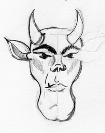
Once I had the sketch where I liked it I scanned it in and imported it to Adobe Illustrator. I scaled it to the size I wanted to work with, reduced the transparency to 50% and locked the layer.


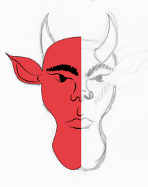
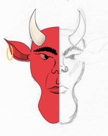
I then created a new layer and started to create my vector outlines. I start by roughing them in and then going back and refining them to follow the sketch. In some places I didn't like the way the lines look once added so I alter them to be more visually appealing. Once I had half the outline done I filled it in with a nice red to get an idea of how the shape looked.

I created another new layer that I added the facial features to. I refined them also to make sure they looked like I wanted them to.

I added the horn and some subtle shading to a new layer.

I added more details to give the image the look I wanted. I then duplicated the left side and flipped it.

Combining the two halves gave me the whole face. I went in and tweaked it some more. Adding extra shading and details to make it look better. One thing I had noticed when I first combined the halves was he looked cross-eyed. I redid the eyes and liked the way he looked finally.


I added some colors and shading to the background and used one of the textures from Crumble. Crackle. Burn. to create the final look. I also used the image as one of my bottle labels for Monster Brew.


Monday, October 12, 2009

Visual Journaling

I was cleaning around my house the other day and came across old sketch books. I find it fascinating to look back through them. Some go all the way back to high school. As a designer sketching is an important way to get ideas down and to work through design problems.

Comic idea from 1993

As I flipped through them I realized I knew exactly where I was and what was going on when I did each sketch. Whether it was an idea for a project, a class in college or a trip. Going analog is a good way to start any design project. It helps to get multiple ideas down in a rough stage and lets you keep a record of those ideas for future use.

Christmas 1995 "cat watching fish"

Thinking about this I dug out some of my college notes and high school notes. Looking back through these I have doodles and sketches on the margins. These doodles helped me to remember what the teacher was talking about in the classes. Being a visual person many of my notes contained doodles of what the teacher was talking about. When test time came I could never remember the words on the page but I could remember the doodles and those would help me answer the questions.

Pizza de Campo, Sienna, Tuscany 1996 "Lovers on the plaza"

Most people keep written journals about their lives or events. I find I keep a visual one. The only problem with it is in the future my kids will have no idea what each drawing was about.

2006 Gibbs Design logo sketches